CSS Layout Notes
Box Pattern
Box Sizing
box-sizing:
content-box(initialvalue).padding-box.border-box.
:root {
  box-sizing: border-box;
}

*,
::before,
::after {
  box-sizing: inherit;
}
Box sizing:
Intrinsic Sizing(内在尺寸): 表示元素最终的尺寸表现是由内容决定的, e.gfit-content/min-content/max-content.Extrinsic Sizing(外在尺寸): 表示元素最终的尺寸表现是由上下文决定的, e.gstretch/-moz-available/-webkit-fill-available.
Box Width
Width Formal Syntax
width:
auto: initial value.<length>.<percentage>.min-content | max-content | fit-content | fit-content(<length-percentage>).
Percentage Width
% width calculate by containing box width:
- 普通元素的百分比宽度是相对于父元素
content box宽度计算. - 绝对定位元素的百分比宽度是相对于第一个
position不为static的祖先元素padding box宽度计算.
Auto Flow Width
Auto flow with css-sizing,
fit-content/min-content/max-content/stretch
for width/min-width/max-width/height/min-height/max-height/
grid-template-rows/grid-template-columns/flex-basis:
fit-content: grow but not overflow.
.content {
  width: fit-content;
  margin: auto;
}

.button {
  box-sizing: border-box;
  width: calc(100% - 30px);
  width: stretch;
  height: 40px;
  margin-right: 15px;
  margin-left: 15px;
}

.table {
  box-sizing: border-box;
  width: 100%;
  width: stretch;
  table-layout: fixed;
}
Min and Max Width
min-width > max-width > width !important:
/* 480px */
.box-1 {
  min-width: 480px;
  max-width: 256px;
}

/* 256px */
.box-2 {
  width: 480px !important;
  max-width: 256px;
}
Box Height
Flow Height
普通文档流是为限定的宽度和无限的高度设计的 (网页元素的默认布局行为):
- 行内元素跟随文字的方向从左到右排列, 当到达容器边缘时会换行.
- 块级元素会占据完整的一行, 前后都有换行.
这导致处理元素高度的方式跟处理宽度不一样:
box-sizing 仍然会影响高度, 但最好避免给元素指定明确的高度.
容器的高度由内容 (子元素) 天然地决定, 而不是容器自己决定.
Percentage Height
% height calculate by containing box height:
- 容器高度为
auto(initialvalue) 时, 其高度通常由子元素高度决定: 浏览器为避免高度计算死循环, 会忽略子元素百分比高度声明. - 容器高度为一个明确值时, 子元素百分比高度才会生效.
Viewport Height
.my-element {
  height: 100vh; /* Fallback for browsers that do not support Custom Properties */
  height: calc(var(--vh, 1vh) * 100);
}
window.addEventListener('resize', () => {
  // Get viewport height and multiple it by 1% to get a value for a vh unit
  const vh = window.innerHeight * 0.01;
  document.documentElement.style.setProperty('--vh', `${vh}px`);
});
Box Margin
Auto Margin
CSS2 visual formatting model:
- If both margin-left and margin-right are auto, their used values are equal.
- If margin-top, or margin-bottom are auto, their used value is 0.
Negative Margin
Negative margin change layout flow:
- Negative
margin-top/margin-left: pull self up/left. - Negative
margin-bottom/margin-right: pull sibling up/left, overlapping self. - Negative
marginalongfloatdirection: pull self. - Negative
marginoppositefloatdirection: pull sibling.
.content {
  float: left;
  width: 100%;
  margin-right: -200px;
}

.sidebar {
  float: left;
  width: 200px;
}
Negative horizontal margin on initial width element make width stretch
(just like positive padding):
/* ul width = 100% + 20px */
ul {
  margin-right: -20px;
}

ul > li {
  float: left;
  width: 100px;
  margin-right: 20px;
}

.blockquote {
  margin: 2rem -2rem;
}
Percentage Margin
Percentage margin calculate by containing block inline size (width),
include margin-top and margin-bottom.
Collapse Margin
- Adjacent siblings: 1's
margin-bottomwith 2'smargin-top. - No content separating parent and descendants:
- No
border/padding/inline part/BFC created/clear: can't separate parentsmargin-topfrom its descendant blocksmargin-top. - No
border/padding/inline content/height/min-height: can't separate parentsmargin-bottomfrom its descendant blocksmargin-bottom. - Collapsed
marginends up outside the parent.
- No
- Empty blocks:
no
border/padding/inline content/height/min-heightto separate block'smargin-topfrom itsmargin-bottom.

margin collapsing calculation:
- 正正取大值.
- 正负值相加.
- 负负最负值.
margin collapsing prevention:
- BFC creation: add
overflow: autoto container. - Add
padding. - Add
border.
Margin collapsing only happen to normal block box vertical direction:
- Line box margin never collapse.
floatbox margin never collapse.absolute/fixedpositioned box margin never collapse.flexchildren.gridchildren.
Invalid Margin
display: inline非替换元素 verticalmargin无效.display: table-cell/display: table-row元素margin无效: e.g<tr>,<td>.position: absolute绝对定位元素未定位方向 (auto)margin:.absolute { top: 10%; left: 30%; }margin-right与margin-bottom改变了外部尺寸, 但无法影响兄弟元素布局.- 定高容器子元素的
margin-bottom或者定宽容器子元素的margin-right的定位作用失效.
Box Padding
Percentage Padding
Percentage padding calculate by containing block inline size (width),
include padding-top and padding-bottom:
.box {
  position: relative;
  padding: 10% 50%;
}

.box > img {
  position: absolute;
  top: 0;
  left: 0;
  width: 100%;
  height: 100%;
}
Box Overflow
visible.hidden: 溢出隐藏基于padding box.clip.scroll.auto.
Box Line Height
Inline Element Line Height
行间距:
- 半行间距 =
(line-height * font-size - font-size) / 2. - 行间距 = 第一行下半行间距 + 第二行上半行间距.
Box Line Height Inheritance
line-height 继承:
%与em继承计算值,number继承数值.line-height最好使用number, 使得子代继承line-height时文字正常排版, 不会出现line-height<font-size导致文字重叠的现象.- Inline level element:
由于
line-height可继承, 一般给父元素设置line-height即可, 会自动作用至容器内所有内联元素. - Block level element:
由于行框盒子幽灵空白节点的存在,
line-height * font-size会决定 block level element 内部元素的最小高度, e.g<div><span></span></div>高度不为0.
Box Vertical Align
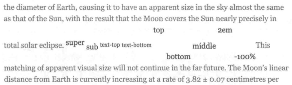
Box Vertical Align Values
vertical-align 有效值:
- 线类:
baseline,top,middle,bottom. - 文本类:
text-top,text-bottom. - 上标下标类:
sub,super. - 数值: 基于
baseline上移 (正数) / 下移 (负数). - 百分比: calculate by
line-height.
Box Vertical Align Applies
vertical-align 作用元素:
- Inline level element:
<span>/<strong>/<em>.<img>/<button>/<input>.::before/::after.
display: table-cell元素.- 用
display: inline-*或display: table-cell以外的方式 创建Box Formatting Context后,vertical-align不再起作用. - 当
line-height过小时,vertical-align在视觉上失效, 调整line-height至足够大时,vertical-align正常起作用.
Box Model
- Inline-level box:
display属性为inline,inline-block,inline-table的元素, 会生成 inline-level box, 并且参与Inline Formatting Context(IFC). - Block-level box:
display属性为block,list-item,table的元素, 会生成 block-level box, 并且参与Block Formatting Context(BFC). Flex Formatting Context(FFC).Grid Formatting Context(GFC).
Inline Box Model
- Not break onto a new line.
widthandheightproperties will not apply.- Vertical
padding,borderandmarginwill not push away other inline boxes. - Horizontal
padding,borderandmarginwill push away other inline boxes.
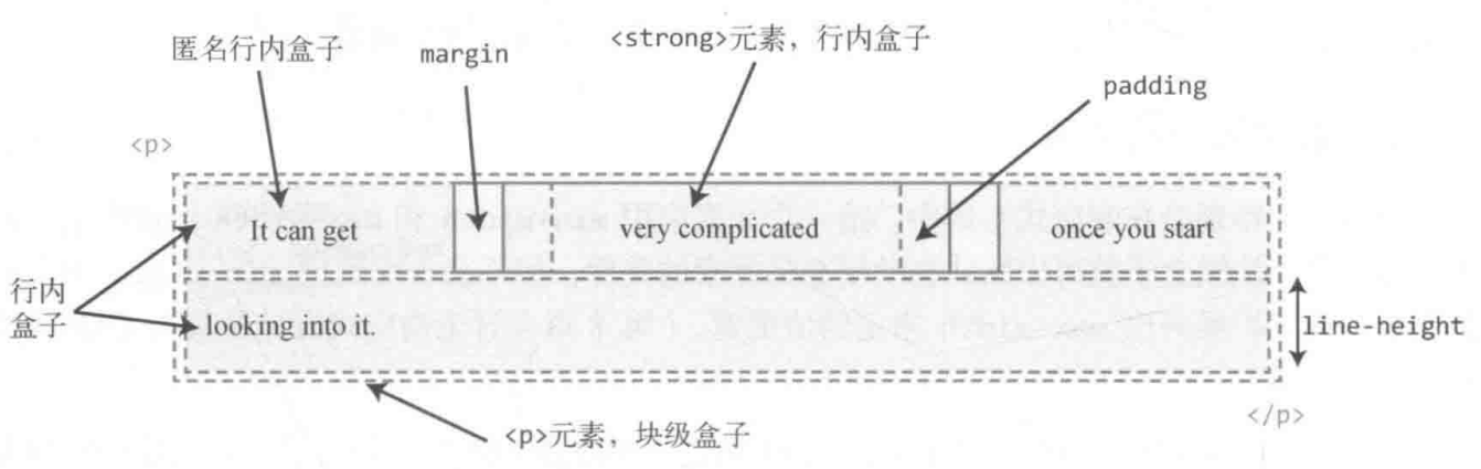
- Not break onto a new line.
widthandheightproperties are respected.padding,borderandmarginwill push away other elements.
Content Area
Character box/em-box/selection box:
一种围绕文字看不见的盒子, 其大小仅受字符本身特性控制, 一般将选中区域等价于此盒子.
Inline Box
- 内联元素形成外部内联盒子, 让元素不成块显示, 而是排成一行.
- 水平间距可通过
padding-inline/border-inline/margin-inline调整, 垂直间距可通过line-height/vertical-align调整, 垂直间距不受padding-block/border-block/margin-block影响. <span>/<a>/<em>tag 会产生一般内联盒子.- Bare text 会产生匿名内联盒子.
::first-line {
  color: white;
  background: red;
}
Line Box
- 每一行会形成一个行框盒子.
- 每个行框盒子的前面有一个幽灵空白节点
(zero-width inline box with the element's
fontandline heightproperties). 父元素的line-height会幽灵空白节点产生作用. - 将内联元素设置为
display: inline-block可以消除幽灵空白节点.
Lines containing Box
<p> tag 会形成一个包含盒子, 此盒子由一行一行的行框盒子组成.
在很多情况下, 容器高度莫名奇妙变大,
都是行框盒子幽灵空白节点 (Strut), line-height, vertical-align 共同作用的结果:
- 容器内部除了显式的内联元素外, 每行还存在幽灵空白节点 (
Strut). line-height可继承, 且基于font-size进行计算.vertical-align默认对齐方式为基线对齐 (baseline).
常见例子有:
<div><span></span></div>高度不为0:Strut撑高容器.<div class="leading-8"><span class="text-2xl">文字</span></div>高度不为32px(leading-8): 当Structfont-size与内联元素font-size差距过大时, 进行文字对齐时会撑高容器.<div><img src="1.jpg"></div>下边缘存在空隙:Strut默认基于基线对齐.
Block Box Model
- Break onto a new line.
- Extend in inline direction to fill space available in its container.
widthandheightproperties are respected.padding,borderandmarginwill push away other elements.
Block Formatting Context Features
BFC 包含创建该上下文元素的所有子元素 (包含性):
- 包含内部所有元素的上下外边距: 它们不会跟 BFC 外部的元素产生外边距折叠 (avoid margin collapse).
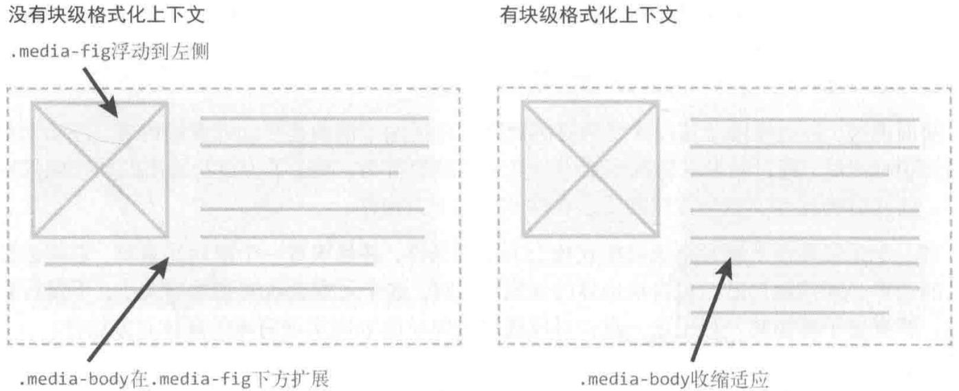
- 包含内部所有的浮动元素: 计算 BFC 的高度时, 浮动元素也参与计算 (avoid height collapse).
- 不包含创建了新 BFC 的子元素的内部元素.
BFC 是页面上的一个隔离的独立容器 (隔离性):
- BFC 不会跟外部的浮动元素 (
float box) 重叠: 可用于实现自适应布局. - BFC 内部的元素与外部的元素相互隔离, 无法相互影响.
- 一个元素不能同时存在于两个 BFC 中.
- 内部的 Box 会在垂直方向, 一个接一个地放置.
- 每个元素的
margin box的左边, 与包含块border box的左边相接触. - 某些情况下,BFC 中的内容可能会与其他 BFC 中的内容重叠:
- 内容太宽, 溢出了容器.
- 设置负外边距, 导致内容被拉到容器外部.
Block Formatting Context Creation
- 根元素或其它包含它的元素.
overflow: notvisible(e.ghidden).position: notstatic/relative(e.gabsolute/fixed).floatelements.display:inline-block.display:table-cell/table-caption/table-*h.display:flow-root.- Flex items: direct children of
flex/inline-flexbox. - Grid items: direct children of
grid/inline-gridbox.
.bfc-1 {
  overflow: hidden;
}

.bfc-2 {
  display: table-cell;
  *display: inline-block; /* For IE7 */
  width: 9999px;
  *width: auto; /* For IE7 */
}
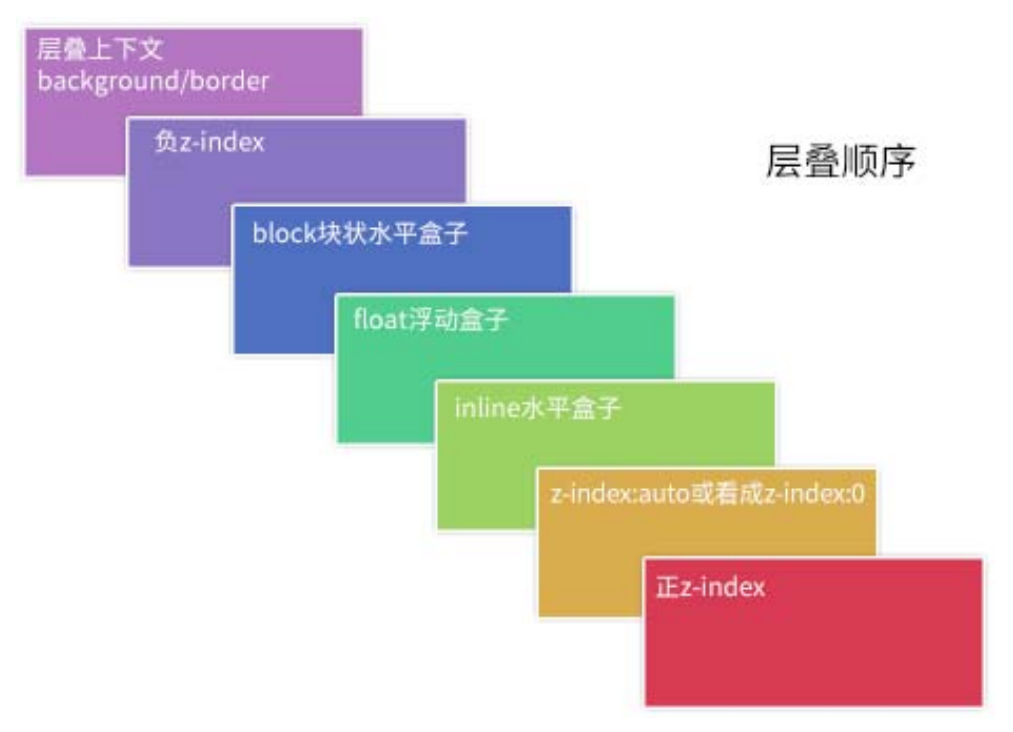
Box Stacking
Stacking Level
Positioned element (non-static position), flex box, grid box
can use the z-index property to adjust its stacking level:
数值越大, 处于可视的优先级越大.
Stacking Context
- The root element
<html>forms theroot stacking context. absolute/relativeelement with non-autoz-index.fixed/stickyelement.flexchildren with non-autoz-index.gridchildren with non-autoz-index.opacity<element.- non-
normalmix-blend-modeelement. transformelement.perspectiveelement.clip-pathelement.mask/mask-image/mask-borderelement.filterelement.backdrop-filterelement.isolation: isolateelement.will-changeabove properties element.containstrict/content/layout/paintelement.
The z-index of elements inside of a stacking context
are always relative to parent current order in its own stacking context.
<!-- .bottom > .inner is on top -->
<div class="top">
  <div class="inner"></div>
</div>
<div class="bottom">
  <div class="inner"></div>
</div>

<style>
  .top,
  .bottom {
    position: relative;
    width: 250px;
    padding: 80px 20px;
  }

  .top {
    z-index: 1;
  }

  .bottom {
    z-index: 2;
  }

  .top > .inner {
    z-index: 999;
  }

  .bottom > .inner {
    z-index: 2;
  }
</style>
Stacking Order
- The background and borders of the root element.
- Descendant non-positioned blocks, in order of appearance in the HTML.
- Descendant positioned elements, in order of appearance in the HTML.
.box {
  /* 创建层叠上下文 */
  position: relative;
  z-index: 0;
  background-image: url('1.png');
}

.box::before,
.box::after {
  position: absolute;
  z-index: -1;
  content: '';
}

.box::before {
  background-image: url('2.png');
}

.box::after {
  background-image: url('3.png');
}
<div class="container">
  <div class="page">标题和内容</div>
</div>

<style>
  .container {
    /* 创建层叠上下文 */
    position: relative;
    z-index: 0;
    background-color: #666;
  }

  .page {
    position: relative;
    background-color: #f4f39e;
  }

  /* 边角卷边阴影 */
  .page::before,
  .page::after {
    /* 层叠上下文(灰色背景)之上, 定位元素(黄色纸张)之下 */
    position: absolute;
    z-index: -1;
    width: 90%;
    height: 20%;
    content: '';
    box-shadow: 0 8px 16px rgb(0 0 0 / 30%);
  }

  /* 边角卷边阴影定位和角度控制 */
  .page::before {
    bottom: 0;
    left: 0;
    transform: skew(-15deg) rotate(-5deg);
    transform-origin: left bottom;
  }

  .page::after {
    right: 0;
    bottom: 0;
    transform: skew(15deg) rotate(5deg);
    transform-origin: right bottom;
  }
</style>
Inline Pattern
Inline Element Height
- 内联元素默认的高度完全受
font-size大小控制. - 内联元素没有可视宽度和可视高度 (
clientHeight/clientWidthalways0), 垂直方向的行为表现完全受line-height和vertical-align的影响.
Inline Element Baseline
Inline Block Element Baseline
inline-block element:
- 内部没有内联元素, 或者
overflownot visible: 其基线为margin底边缘. - 内部存在内联元素: 其基线为最后一行内联元素的基线.
Vertical Align Baseline
Inline element 与父元素下边缘存在空隙,
原因在于文字排版的基线 (baseline) 对齐机制:
- 在标准模式中,
Inline Formatting Context总是会包含类似字母 'g'/'f' 尾巴伸出部分空间 (针对下行字母). <img>/<a>inline element 与父元素底部若干像素间隙, 实际上是此种情况下的字母尾巴预留机制: 行框盒子存在幽灵空白节点, 默认基于baseline对齐 (小写字母x底部).
清除间隙的方法:
- �清除
Strut高度: 父元素font-size: 0/line-height: 0, 设置Inline Formatting Context高度为0. - 改变对齐方式:
子元素
vertical-align设置为top/middle/bottom. - 清除
Strut节点: 子元素display设置为inline-block/block, 创建Block Formatting Context, 直接清除幽灵空白节点.
可以用以上方法解决 <img> image 5px problem 或相似问题.
Inline Element Padding
可以在不影响当前布局的情况下,
通过增加垂直方向的 padding,
增加链接 (inline) 或按钮 (inline-block) 的点击区域大小:
article a {
  padding: 0.25rem 0;
}
Inline Element Margin
非主动触发位移的内联元素是不会位移至计算容器外部,
内联元素 margin-top 设置过大时 margin-top 会直接失效,
内联元素依然会处于基线对齐位置.
Position Pattern
Static Position
- Normal flow.
top/bottom/left/right/inset/z-indexhave no effect.
Relative Position
- 使元素相对于
static布局. - 可使用
top/bottom/left/right/inset属性进行定位. - 相对方向 (opposite) 的定位同时设置:
top覆盖bottom,left覆盖right. - 初始位置被保留 (仍占用原始空间), 不脱离文档流.
Absolute Position
- 使元素相对于
containing block布局:- Non-
staticpositionelement. transformelement.perspectiveelement.will-change: transform/will-change: perspectiveelement.filterelement.backdrop-filterelement.containstrict/content/paintelement.
- Non-
- 若祖先全为无法构成
containing block的元素, 则使元素相对于浏览器窗口布局. - 可使用
top/bottom/left/right/inset属性进行定位. - 相对方向 (opposite) 的定位同时设置:
若未显示设置该方向的元素大小, 则元素具有流动性, 受
containing block影响其大小,.fluid { position: absolute; left: 0; right: 0; }. - 初始位置不被保留, 脱离文档流.
floatcomputed tofloat: none.display:inline-tablecomputed totable.inline/inline-block/table-*computed toblock.
.tooltip {
  position: absolute;
}

.form-alert,
.form-warning,
.form-info {
  position: absolute;
}

.overlay {
  position: absolute;
  top: 0;
  left: 0;
  z-index: -50;
  width: 100%;
  height: 100%;
  background: rgb(0 0 0 / 50%);
}
可以利用 absolute 模拟 fixed 布局:
<html>
  <body>
    <div class="page">滚动内容区域</div>
    <div class="fixed">固定定位元素</div>
  </body>
  <style>
    html,
    body {
      height: 100%;
      overflow: hidden;
    }

    .page {
      height: 100%;
      overflow: auto;
    }

    .fixed {
      position: absolute;
    }
  </style>
</html>
Fixed Position
- 使元素相对于
containing block布局:- Initial
containing block: 浏览器窗口, 且不受滑动条影响. transformelement.perspectiveelement.will-change: transform/will-change: perspectiveelement.filterelement.backdrop-filterelement.containstrict/content/paintelement.
- Initial
- 可使用
top/bottom/left/right/inset属性进行定位. - 初始位置不被保留, 脱离文档流.
floatcomputed tofloat: none.display:inline-tablecomputed totable.inline/inline-block/table-*computed toblock.
Sticky Position
- 使元素相对于 non-
visibleoverflow祖先 (nearest scrolling ancestor) 布局: 要利用position: sticky实现视窗定位效果, 最好保证祖先全为overflow: visible元素, 使得视窗成为其 nearest scrolling ancestor. - 若祖先全为
overflow: visible元素, 则使元素相对于浏览器窗口与containing block布局:containing block为 BFC creation element:- Block container.
- Table container.
- Flex container.
- Grid container.
- 粘性定位元素在它距离视窗顶部大于
XXX时, 会按照默认布局, 表现为relativeposition. - 一旦其距离顶部的距离等于
XXX, 元素会固定在窗口顶部, 表现为fixedposition.
- 粘性定位元素不能超出粘性约束矩形范围的限制:
- 当
containing block移动到窗口外时, 粘性定位元素也会跟着消失. - 黏性定位元素在同一个容器下会重叠, 在不同容器下则会依次推开: 黏性定位元素分布在一个容器时, 共用一个巨大的黏性约束矩形, 黏性定位元素分布在不同容器时, 存在多个竖直排列的黏性约束矩形.
- 若粘性定位元素父元素的高度和粘性定位元素的高度相同, 则垂直滚动时, 粘性定位效果始终不会出现.
- 可以利用这一特性, 实现层次滚动/视差滚动效果 (
Parallax).
- 当
.sticky {
  position: sticky;
  top: 0;
  margin-top: 50px;
}
Percentage Position
Positioned elements percentage top/bottom/left/right/inset
calculate by containing block height:
If containing block height is auto, it calculated to 0.
Position Reference
positionproperty impact ondisplayitems.
Float Pattern
Float Element
- 包裹性:
- 宽度受子元素影响.
- 宽度受 containing block 影响.
- 块状化并格式化上下文.
- 没有任何
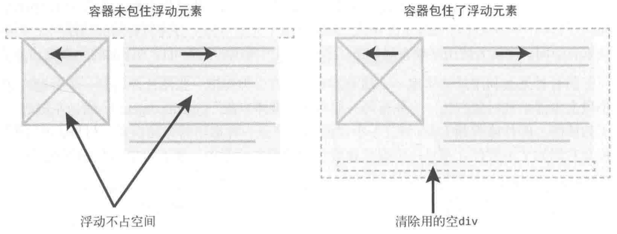
margin合并. - 破坏文档流: 父级高度塌陷.
- 浮动元素的浮动参考 (
float reference) 是行框盒子:- 浮动元素在当前行框盒子内定位.
float: leftbox is positioned at begin of line box.float: rightbox is positioned at end of line box.- Non-floaty flow (text) is laid out along edges of floating boxes.
- 浮动元素与行框盒子不可重叠: 行框盒子会缩短以容纳浮动盒子, 会形成文字环绕效果.
浮动元素与 BFC 一起布局时, BFC 会收缩以容纳浮动盒子, 此时会忽略自己的边界必须接触包含块边界的规则. 可用此特性创建自适应布局:
Float Block Formatting Context
float make element specified value of display:
inline-tablecomputed totable.inline-flexcomputed toflex.inline-gridcomputed togrid.inline/inline-block/table-*computed toblock.
Fixed Parent
Floating won't work inside fixed or absolute div unless specify width:
.parent {
  position: fixed;
  top: 5px;
  left: 0;
  width: 100%;
}
Float Clear Fix
为父容器 (.row) 添加 .clearfix:
clear只能作用于 block level element:::before/::after默认为 inline level element,display: table将::before/::after转换为 block level element.clear: both本质是让自身不和浮动元素在同一行排列, 并没有真正意义上地清除浮动元素的float(仍然脱离文档流):::after伪元素不与浮动元素在同一行, 其形成的盒子自然而然地撑起了父容器的高度, 使得因浮动元素脱离文档流而塌陷的父容器恢复正常高度.
.clearfix::before,
.clearfix::after {
  display: table;
  content: '';
}

.clearfix::after {
  clear: both;
}

.clearfix {
  *zoom: 1; /* display: inline-block BFC creation for IE7 */
}
Column Pattern
Two Column Pattern
Block Two Column
inline-block+inline-block.
Absolute Two Column
absolute+margin-left: absolute element not in normal flow.- 利用父元素
relative与子元素absolute进行布局.
.div-1 {
  position: relative;
}

.div-1a {
  position: absolute;
  top: 0;
  right: 0;
  width: 200px;
}

.div-1b {
  position: absolute;
  top: 0;
  left: 0;
  width: 200px;
}
Float Two Column
float+float.float+margin-left: block element ignore float element, inline element surround float element.float+ BFC.
.container {
  overflow: hidden; /* BFC creation */
}

.left {
  float: left;
  width: 60px;
  height: 60px;
}

.right {
  margin-left: 70px;
  overflow: hidden; /* BFC creation */
}
Three Column Pattern
Absolute Three Column
Position .left and .right with absolute,
add margin-left and margin-right to .middle.
Float Three Column
<div class="left"></div>
<div class="right"></div>
<div class="middle"></div>
.left {
  float: left;
}

.right {
  float: right;
}

.middle {
  margin: 0 right-width 0 left-width;
}
For float element:
- Negative
marginalong the float direction: pull thefloatelement in that direction. - Negative
marginopposite the float direction decrease the float area, causing adjacent elements to overlap thefloatelement.
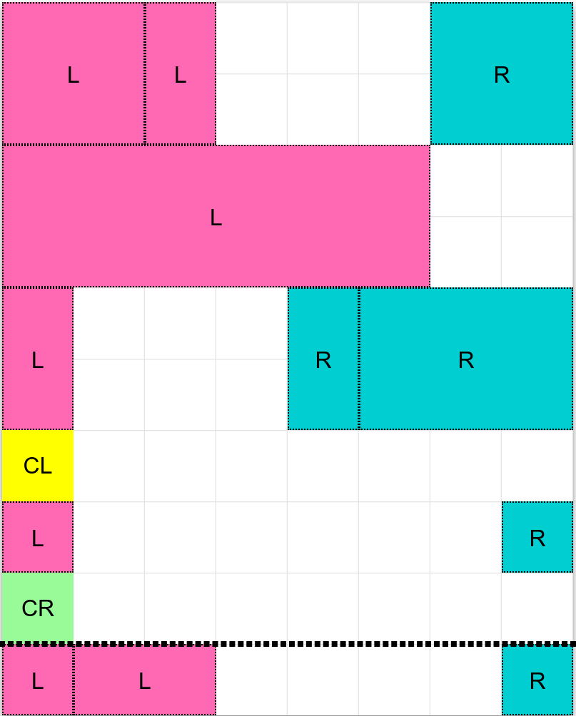
圣杯布局:
- HTML:
.middlefirst. - Padding:
padding-leftandpadding-rightto.container,min-width: 2 * (leftWidth + rightWidth)to.container. - Float:
float: leftto.left,.middleand.right(Currently,.middlein row 1,.leftand.rightin row 2). - Negative margin:
margin-left: -100%to.left,margin-right: -rightWidth pxto.right(Pull them up to same row with.middle). - Move:
right: leftWidth pxto.left(Adjust.leftposition).
<div class="container">
  <div class="middle"></div>
  <div class="left"></div>
  <div class="right"></div>
</div>
.container {
  padding: 0 200px 0 300px; /* padding-left = .left width, same to .right */
}

.container .middle {
  float: left;
  width: 100%;
  background-color: violet;
}

.container .left {
  position: relative;
  right: 300px;
  float: left;
  width: 300px;
  margin-left: -100%;
  background-color: darkblue;
}

.container .right {
  position: relative;
  float: left;
  width: 200px;
  margin-right: -200px;
  background-color: red;
}
Multiple Column Pattern
Multiple column layout:
columns:<'column-width'> || <'column-count'>.- 分栏实际数目 = .
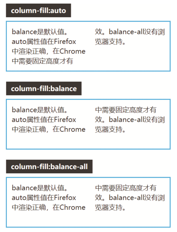
column-width:auto | <length>, 期望分栏宽度.column-count:auto | <integer>, 期望分栏数目.column-gap:normal | <length-percentage>, 分隔间隙.column-rule:<'column-rule-width'> || <'column-rule-style'> || <'column-rule-color'>, 分隔线.column-rule-width(<line-width>):medium | thin | thick | <length>.column-rule-style(<line-style>):none | hidden | dotted | dashed | solid | double | groove | ridge | inset | outset.column-rule-color:currentcolor | <color>.column-span:none | all, 子元素宽度.column-fill:balance | balance-all | auto, 子元素分布.break-inside:auto: Allows break.avoid: Avoids break.
.three-column {
  column-gap: 1em;
  padding: 1em;
  column-count: 3;
}

.three-column > .last-child {
  column-span: all;
}
Flex Pattern
Flex Box Width
最终尺寸计算:
- 优先级: 最大最小尺寸 > 弹性增长或收缩 > 基础尺寸.
- When there is free space left: used size = .
- When there is not enough space: used size = .
flex-basis | width | 基础尺寸 |
|---|---|---|
| set | x | flex-basis |
| auto | set | width |
| auto | auto | 最大内容宽度 |
min-width | width | 最小尺寸 |
|---|---|---|
| set | x | min-width |
| auto | set | min(width, 最小内容宽度) |
| auto | auto | 最小内容宽度 |
.container {
  display: flex;
}

.initial {
  /* width: 100px~200px */
  flex: initial;
  width: 200px;
  min-width: 100px;
}

.none {
  /* width: 200px */
  flex: none;
  width: 200px;
}

.flex1 {
  /* width: left width * 1/3 */
  flex: 1;
}

.flex2 {
  /* width: left width * 2/3 */
  flex: 2;
}
Flex Shorthand Property
flex
= none | [<'flex-grow'> <'flex-shrink'>? || <'flex-basis'>]:
flex-grow:<number>.flex-shrink:<number>.flex-basis:content | <'width'>.flex: initial: 属性默认值, 元素会根据自身宽高设置尺寸. 它会缩短自身以适应容器, 但不会伸长并吸收 flex 容器中的额外自由空间来适应容器, equal toflex: 0 1 auto.flex: none: 元素会根据自身宽高来设�置尺寸. 它是完全非弹性的: 既不会缩短, 也不会伸长来适应容器, equal toflex: 0 0 auto.flex: auto | <'width'>: 元素会根据自身的宽度与高度来确定尺寸, 但是会自行伸长以吸收 flex 容器中额外的自由空间, 也会缩短至自身最小尺寸以适应容器, equal toflex: 1 1 auto | 1 1 <'width'>.flex: <number>: 元素会被赋予一个容器中自由空间的指定占比, equal toflex: <number> 1 0%.
flex: none: 适合设置在内容不能换行显示的小控件元素上, e.g<button>.flex: auto: 适合基于内容动态适配的布局.flex: 0: 适用场景较少, 适合设置在替换元素的父元素上.flex: 1: 适合等分布局.
Flex Children Display
Flexbox 会改变子元素 display 属性值:
| Initial Display | Flex Children Display |
|---|---|
inline/inline-block/block | block |
flow-root | flow-root |
list-item | list-item |
inline-table/table | table |
table-* | block |
inline-flex/flex | flex |
inline-grid/grid | grid |
Flexbox 子元素:
- 均为块级元素:
vertical-align无效化.- 裸文本子元素会变为匿名块级元素 (Text nodes and pseudo elements can be flex children).
float无效化.margin不合并.- 支持
z-index(包括position: static子元素):z-index不为auto时创建层叠上下文. absolute定位子元素会脱离弹性布局.
Flex Flow
flex-flow: <'flex-direction'> || <'flex-wrap'>.
Flex Direction
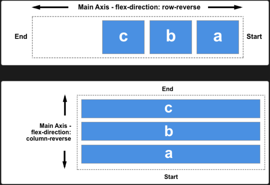
flex-direction:
row.row-reverse.column.column-reverse.
flex-direction will change flex alignment direction and start line:
Flex Wrap
flex-wrap:
nowrap: 不换行.wrap: 换行.wrap-reverse.
Flex Alignment
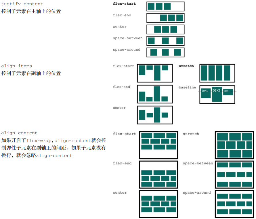
Flex Parent Alignment
justify-content, defines alignment along main axis:normal: items packed in default position.stretch: behaves asflex-start(stretching in main axis controlled byflex).space-between/space-around/space-evenly.center/start/end/flex-start/flex-end.left/right.
align-items, defines alignment (align-self) for cross axis:normal: behaves asstretch/start.baseline.stretch.center/start/end/self-start/self-end/flex-start/flex-end.
align-content, aligns flex container's lines within when there is extra space in the cross-axis:normal: items packed in default position.baseline.stretch/space-between/space-around/space-evenly.center/start/end/flex-start/flex-end.
*-contentadjust parent padding,*-itemsand*-selfadjust children margin.
Flex Children Alignment
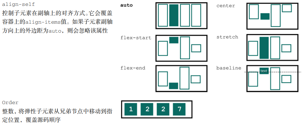
align-self:auto: computes to parentalign-itemsvalue.normal: behaves asstretch/start.baseline.stretch.center/start/end/self-start/self-end/flex-start/flex-end.
order:<number>, 显示顺序, 初始为0.
Flex Margin Alignment
Aligning with auto margin:
<div class="parent">
  <div class="child"></div>
</div>

<style>
  .parent {
    display: flex;
  }

  .child {
    /* This will push child to the right of parent border */
    margin-left: auto;
  }
</style>
最后一行左对齐:
.container {
  display: flex;
  flex-wrap: wrap;
  justify-content: space-between;
}

.list {
  margin: 10px;
}

.list:last-child {
  margin-right: auto;
}
Flex Centering Alignment
/* 子元素全部居中对齐 */
.vertical-container {
  display: flex;
  align-items: center;
  justify-content: center;
  height: 300px;
}
.layer {
  display: flex;
  flex-direction: row;
  flex-grow: 1;
  align-items: center;
  justify-content: flex-start;
  margin: 5px;
  background-color: #fff;
  border: 1px solid #000;
}
Flexbox Pseudo Element
Set flex to pseudo elements of flex box
will change width of pseudo elements.
.flex {
  display: flex;
}

.flex::before {
  position: relative; /* no need for absolute position */
  display: block;
}
Fixed Sidebar Flexbox
<body>
  <aside></aside>
  <main></main>
</body>
body {
  display: flex;
  height: 100vh;
  margin: 0;
}

aside {
  flex: 0 0 auto; /* inflexible */
}

main {
  flex: 1 1 auto; /* auto flexible */
  overflow: auto;
}
Flex Reference
Grid Pattern
Grid Box Width
Grid Item Automatic Minimum Size
Grid item default min-width is set to auto,
grid item can't be smaller than its children:
<div class="grid">
  <div class="item">
    <p>Very very very very very long sentence.</p>
  </div>
  <div class="item">
    <p>Very very very very very long sentence.</p>
  </div>
  <div class="item">
    <p>Very very very very very long sentence.</p>
  </div>
  <div class="item">
    <p>Very very very very very long sentence.</p>
  </div>
  <div class="item">
    <p>Very very very very very long sentence.</p>
  </div>
  <div class="item">
    <p>Very very very very very long sentence.</p>
  </div>
</div>

<style>
  .grid {
    display: grid;
    grid-template-columns: repeat(3, 1fr);
    grid-gap: 20px;
  }

  /**
   * Grid item default `min-width` is `auto`,
   * 导致 grid item 内的段落完整显示整行长句.
   */
  .item {
    border: 1px solid red;
  }

  /**
   * Grid item 内的段落正常截断.
   */
  .item-fixed {
    /* Method 1 */
    min-width: 0;

    /* Method 2 */
    overflow: hidden;
  }

  p {
    overflow: hidden;
    text-overflow: ellipsis;
    white-space: nowrap;
  }
</style>
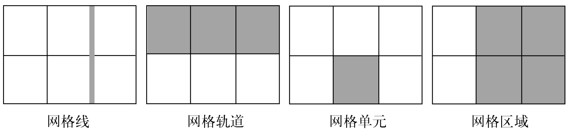
Grid Property
Parent property:
grid:grid-template:grid-template-rows.grid-template-columns.grid-template-areas.
grid-auto-rows.grid-auto-columns.grid-auto-flow.
gap:row-gap.column-gap.
place-content:align-content.justify-content.
place-items.align-items.justify-items.
Children property:
grid-area:grid-row:grid-row-start.grid-row-end.
grid-column:grid-column-start.grid-column-end.
place-self:align-self.justify-self.
.container {
  grid-template-areas:
    'header header header'
    'advert content content'
    'footer footer footer';
  grid-template-rows: 1fr 1fr 1fr;
  grid-template-rows: minmax(90px, 1fr);
  grid-template-columns: 1fr 1fr 1fr;
  grid-template-columns: repeat(3, 1fr);
  gap: 10px;
  place-items: end center;
}

.item {
  grid-area: footer;
  grid-row: start / end; /* 2 / -1 */
  grid-column: start / end;
  place-self: end center;
}
Grid Data Types
Grid Breadth Types
<track-breadth>:
<flex>:<number>fr, fraction.<length-percentage>.min-content.max-content.auto.
<inflexible-breadth>:
<length-percentage>.min-content.max-content.auto.
<fixed-breadth>:
<length-percentage>.
Grid Size Types
<track-size>:
<track-breadth>.minmax(<inflexible-breadth>, <track-breadth>).fit-content(<length-percentage>).
<fixed-size>:
<fixed-breadth>.minmax(<fixed-breadth>, <track-breadth>).minmax(<inflexible-breadth>, <fixed-breadth>).
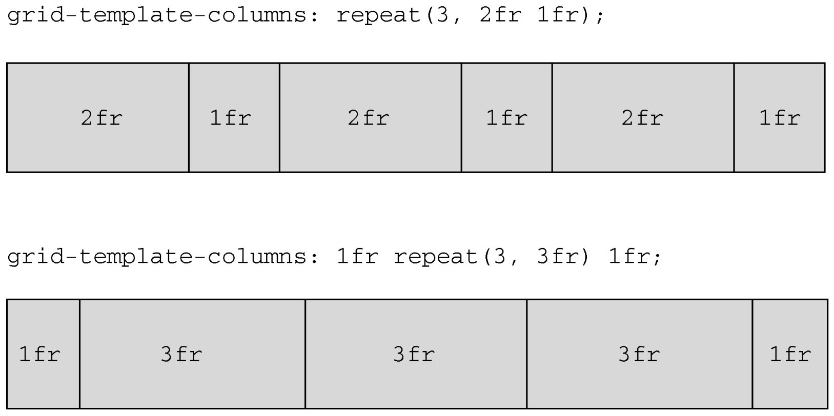
Grid Repeat Types
<track-repeat>:
repeat([<integer [1,∞]>], [<line-names>? <track-size>]+ <line-names>?).
<fixed-repeat>:
repeat([<integer [1,∞]>], [<line-names>? <fixed-size>]+ <line-names>?).
<auto-repeat>:
repeat([auto-fill | auto-fit], [<line-names>? <fixed-size>]+ <line-names>?).
<name-repeat>:
repeat([auto-fill | <integer [1,∞]>], <line-names>+).
Grid Line Types
<grid-line>:
auto.<custom-ident>[<integer> && <custom-ident>?].[span && [<integer> || <custom-ident>]].
Responsive Grid Layout
Explicit Responsive Grid Layout
fit-content(limit):clamp([min-content | min-width], limit, max-content).minmax([<fixed-breadth> | <inflexible-breadth>], [<track-breadth> | <fixed-breadth>]).repeat([<integer [1,∞]> | auto-fill | auto-fit], [<track-size> | <fixed-size>]+).
.container {
  display: grid;
  grid-template-columns: fit-content(var(--sidebar-max, 20ch)) minmax(50%, 1fr);
  grid-template-columns: repeat(auto-fit, minmax(400px, 1fr));
  grid-template-columns: repeat(
    auto-fit,
    minmax(min(100%, var(--grid-min, 30ch)), 1fr)
  );
}
Implicit Responsive Grid Layout
grid-auto-rows/grid-auto-columns:
<track-size>+.- Control implicitly-created grid track (row/column) size.
<div class="container">
  <item>1</item>
  <item>2</item>
  <item>3</item>
  <item>4</item>
  <item class="implicit">5</item>
</div>

<style>
  .container {
    display: grid;
    grid-template: 1fr 1fr / 1fr 1fr;

    /* 隐式网格高度为 60px */
    grid-auto-rows: 60px;
  }
</style>
<div class="container">
  <item class="item-a">a</item>
  <item class="item-b">b</item>
</div>
<style>
  .container {
    display: grid;
    grid-template: 1fr 1fr / 1fr 1fr;

    /* 隐式网格宽度为 60px */
    grid-auto-columns: 60px;
  }

  .item-b {
    /* 超出网格列数, 隐式网格创建 */
    grid-column: 3 / 4;
    background-color: rgb(255 255 0 / 50%);
  }
</style>

grid-auto-flow:
[row | column] || dense.- Change auto-placement algorithm:
control exactly how auto-placed items get flowed into grid container,
like
flex-directionfor flex container.
.gallery {
  display: grid;
  grid-template-columns: repeat(auto-fill, minmax(200px, 1fr));
  grid-auto-rows: 1fr;
  grid-auto-flow: dense;
  grid-gap: 1em;
}
Named Grid Layout
Grid Lines
grid-row and grid-column
change start and end of <grid-line>
will refactor grid item's size and location:
.main {
  display: grid;
  grid-template-rows: [header] 100px [body] auto;
  grid-template-columns: [l-gutter] 1fr [sidebar] 4fr [content] 8fr [r-gutter] 1fr;
  gap: 1rem 2rem;
}

.header {
  grid-row: header;
  grid-column: sidebar / right-gutter;
}

.sidebar {
  grid-row: body;
  grid-column: sidebar;
}

.content {
  grid-row: body;
  grid-column: content;
}
隐式网格线:
<custom-ident>: 当<custom-ident>不存在时, 会尝试匹配<custom-ident-start>或者<custom-ident-end>.<integer> && <custom-ident>: 当第<integer>个<custom-ident>不存在时, 会在网格容器后方额外创建隐式网格.span && <custom-ident>: 当<custom-ident>不存在时, 会在网格容器前方或者后方额外创建隐式网格.
.container {
  display: grid;
  grid:
    '. . .' 1fr
    '. a .' 1fr
    '. . .' 1fr / 1fr 1fr 1fr;
}

.item {
  grid-area: a;
  grid-area: a / a / a / a;
  grid-area: a-start / a-start / a-end / a-end;
}
.container {
  display: grid;
  grid-template-columns: [a] 80px [b] auto [c] 100px [d];
}

.item {
  /**
   * .container: [a] 80px [b] auto [c] 100px [d] auto [b] auto [b] auto [b]
   * .item: [c] 100px [d] auto [b] auto [b] auto [b]
   */
  grid-column: b 4 / c;
}
.container {
  display: grid;
  grid-template-columns: [a] 80px [c] auto [c] 100px [d] auto auto;
}

.item {
  /**
   * .container: [b] auto [a] 80px [c] auto [c] 100px [d] auto auto
   * .item: [b] auto [a] 80px [c] auto [c] 100px [d]
   */
  grid-column: span b / 4;
}
Extending elements beyond the content area with named grid lines:
.content {
  --gap: clamp(1rem, 6vw, 3rem);
  --full: minmax(var(--gap), 1fr);
  --content: min(50ch, 100% - var(--gap) * 2);
  --popup: minmax(0, 2rem);
  --feature: minmax(0, 5rem);

  display: grid;
  grid-template-columns:
    [full-start] var(--full)
    [feature-start] var(--feature)
    [popup-start] var(--popup)
    [content-start] var(--content) [content-end]
    var(--popup) [popup-end]
    var(--feature) [feature-end]
    var(--full) [full-end];
}

.content > * {
  grid-column: content;
}

.popup {
  grid-column: popup;
}

.feature {
  grid-column: feature;
}

.full {
  grid-column: full;
}
Grid Areas
- 网格线自动命名:
areaName-start/areaName-end.
.container {
  grid-template: 1fr 1fr 1fr 1fr / 1fr 1fr 1fr;
  grid-template:
    'grape grape grape' 1fr
    'apple orange orange' 1fr
    'apple orange orange' 1fr
    'banana banana banana' 1fr
    / 1fr 1fr 1fr;
  grid-template:
    [row-name1-start] 'grape grape grape' 1fr [row-name1-end row-name2-start]
    'apple orange orange' 1fr [row-name2-end]
    'apple orange orange' 1fr [row-name3-end]
    [row-name4-start] 'banana banana banana' 1fr [row-name4-end]
    / [col-name-start] 1fr [col-name-end] 1fr 1fr;
  grid-template-areas:
    'grape grape grape'
    'apple orange orange'
    'apple orange orange'
    'banana banana banana';
}

.grape {
  grid-area: grape;
}

.apple {
  grid-area: apple;
}

.orange {
  grid-area: orange;
}

.banana {
  grid-area: banana;
}
Grid Gap
CSS Box Alignment Module Level 3
统一了分栏布局, 弹性布局, 网格布局的 gap 属性:
gap:<'row-gap'> <'column-gap'>?.row-gap:normal | <length-percentage>.column-gap:normal | <length-percentage>.
Grid Alignment
justify-content/align-contentcontent within element, attach to parent css selector (effectively adjustspaddingof parent)justify-items/align-itemsalign items inside box, attach to parent css selector (effectively adjustsmarginof children)justify-self/align-selfalign element within parent, attach to children css selector (effectively adjustsmarginof children)place-content:<'align-content'> <'justify-content'>?.place-items:<'align-items'> <'justify-items'>?.place-self:<'align-self'> <'justify-self'>?.
justify-items, defines the defaultjustify-selffor all items:normal: behaves asstretch/start.baseline.stretch.center/start/end/self-start/self-end/flex-start/flex-end.left/right.
justify-self:auto: computes to parentjustify-itemsvalue.normal: behaves asstretch/start.baseline.stretch.center/start/end/self-start/self-end/flex-start/flex-end.left/right.
Grid Pseudo Element
Adding background and border is a missing feature of
CSS Grid specification,
you can styling empty grid cells and areas with
generated pseudo elements:
.grid::after {
  z-index: -1;
  grid-row: 1 / 4;
  grid-column: 2 / 5;
  content: '';
  background-color: rgb(214 232 182 / 30%);
  border: 5px solid rgb(214 232 182);
}
Implement fancy <h1> header:
h1.lines {
  display: grid;
  grid-template-columns: 1fr auto 1fr;
  gap: 1em;
  text-align: center;
}

@supports (display: grid) {
  h1.lines::before,
  h1.lines::after {
    align-self: center;
    content: '';
    border-top: 1px solid black;
  }
}
Conditionally styling selected elements in grid container:
<main>
  <input type="checkbox" />
  <input type="checkbox" />
  <input type="checkbox" />
  <input type="checkbox" />
  <input type="checkbox" />
  <input type="checkbox" />
  <input type="checkbox" />
  <input type="checkbox" />
  <input type="checkbox" />
  <input type="checkbox" checked />
  <input type="checkbox" checked />
  <input type="checkbox" checked />
  <input type="checkbox" checked />
  <input type="checkbox" />
  <input type="checkbox" />
  <input type="checkbox" />
  <input type="checkbox" />
  <input type="checkbox" />
  <input type="checkbox" />
  <input type="checkbox" />
  <input type="checkbox" />
  <input type="checkbox" />
  <input type="checkbox" />
  <input type="checkbox" />
  <input type="checkbox" />
  <input type="checkbox" />
  <input type="checkbox" />
  <input type="checkbox" />
  <input type="checkbox" />
  <input type="checkbox" />
</main>

<style>
  main {
    display: grid;
    grid: repeat(5, 60px) / repeat(7, 60px);
    place-items: center center;
    margin: 0;
  }

  input {
    display: grid;
    width: 40px;
    height: 40px;
    margin: 0;
    appearance: none;
    cursor: pointer;
    background: #ddd;
    border-radius: 20px;
  }

  input:not(:nth-of-type(7n + 1))::before,
  input:nth-of-type(n + 8)::after {
    z-index: -1;
    grid-area: 1/1;
    pointer-events: none;
    content: '';
    border-radius: 20px;
  }

  input:not(:nth-of-type(7n + 1))::before {
    transform: translateX(-60px);
  }

  input:nth-of-type(n + 8)::after {
    transform: translateY(-60px);
  }

  input:checked {
    background: limegreen;
  }

  /* a box's right borders */
  input:not(:nth-of-type(7n)):checked + input:checked::before {
    background: limegreen;
    border-top-right-radius: 0;
    border-bottom-right-radius: 0;
  }

  /* a box's bottom borders */
  input:nth-last-of-type(n + 8):checked
    + *
    + *
    + *
    + *
    + *
    + *
    + input:checked::after {
    background: limegreen;
    border-bottom-right-radius: 0;
    border-bottom-left-radius: 0;
  }

  /* a box's adjacent (right side) box's left borders */
  input:not(:nth-of-type(7n)):checked + input:checked + input::before {
    background: limegreen;
    border-top-left-radius: 0;
    border-bottom-left-radius: 0;
  }

  /* a box's adjacent (below) box's top borders */
  input:not(:nth-of-type(7n)):checked
    + *
    + *
    + *
    + *
    + *
    + *
    + input:checked
    + input::before {
    background: limegreen;
    border-top-left-radius: 0;
    border-top-right-radius: 0;
  }

  /* a box's (in last column) left borders */
  input:nth-of-type(7n-1):checked + input:checked {
    border-top-left-radius: 0;
    border-bottom-left-radius: 0;
  }

  /* a box's (in last column) adjacent (below) box's top borders */
  input:nth-of-type(7n):checked + * + * + * + * + * + * + input:checked {
    border-top-left-radius: 0;
    border-top-right-radius: 0;
  }
</style>
Grid System
- Must have different traits at different sizes.
- Must be fluid between breakpoints.
- Must have enough control to decide which columns will transform and at which point.
- Classes should ideally still make sense at all breakpoints.
Grid Reference
- Grid complete guide.
Alignment Pattern
Height Alignment Pattern
bordersimulation.- Negative
margin. absoluteelement:.absolute { top: 0; bottom: 0; }使所有子元素 (absolute) 与父元素 (relative) 等高.tablelayout:display: table-cell默认等高.flexlayout:flexitems 默认拉伸至盒子高度.gridlayout:griditems 默认等高.
Border Simulation Height Alignment
/* 导航背景区 border 创建 */
.box {
  background-color: #f0f3f9;
  border-left: 150px solid #333;
}

/* 清除浮动影响 */
.box::after {
  display: block;
  clear: both;
  content: '';
}

/* 布局主结构 */
.box > nav {
  float: left;
  width: 150px;
  margin-left: -150px;
}

.box > section {
  overflow: hidden;
}
Negative Margin Height Alignment
.column-box {
  overflow: hidden; /* hidden overflow background */
}

/* 视觉等高布局 */
.column-left,
.column-right {
  padding-bottom: 9999px;
  margin-bottom: -9999px;
}
Layout Height Alignment
.table {
  display: table;
  overflow: hidden;

  .left {
    display: table-cell;
    width: 200px;
    background: #4caf50;
  }

  .right {
    display: table-cell;
    width: 800px;
    background: #99afe0;
  }
}

.flex {
  display: flex;
  flex-flow: row nowrap;
  align-items: stretch;

  .left {
    flex: 200px 0 0;
    background: #4caf50;
  }

  .right {
    flex: auto 1 0;
    background: #99afe0;
  }
}

.grid {
  display: grid;
  grid-template-columns: 200px auto;
  align-items: stretch;

  .left {
    background: #4caf50;
  }

  .right {
    background: #99afe0;
  }
}
Centering Pattern
Horizontal Centering Pattern
Horizontal Centering Inline Element
text-align: center.flex.grid.
.quote {
  text-align: center;
}
Horizontal Centering Block Element
- Auto
margin. flex.grid.
.row {
  width: 100%;
  max-width: --var(row-max-width);
  margin: 0 auto;
}

.container {
  max-width: 1024px;
  margin: 0 auto;
}
父元素 float, 父子元素 relative:
.container {
  position: relative;
  left: 50%;
  float: left;
}

.container ul {
  position: relative;
  left: -50%;
}
Vertical Centering Pattern
Vertical Centering Inline element
line-height.vertical-align: middle:- 作用机制: 对齐基线 (
baseline) 往上 1/2x-height高度 (即小写字母x交叉点处). - 作用环境: parent element
line-height===height. - 作用对象: children
inline/inline-block/table-cellelement.
- 作用机制: 对齐基线 (
- Vertical parent
padding. flex.grid.
Button label (<a>) vertical alignment
(行内块居中法:
a.button::before {
  display: inline-block;
  height: 16px;
  vertical-align: middle;
  content: '';
}
Vertical Centering Block element
top+translateY.vertical-align: middle+display: table-cell: 表格单元居中法.- Vertical
margin. - Vertical
padding. flex.grid.
.viewport-centered-block {
  width: 18em;
  margin: 50vh auto 0;
  transform: translateY(-50%);
}

.form-item-label {
  display: flex;
  flex-direction: row;
  align-items: center;
}
Mixing Centering Pattern
.box {
  position: absolute;
  top: 50%;
  left: 50%;
  transform: translate(-50%, -50%);
  backface-visibility: hidden; /* Remove blurry in WebKit browsers */
  transform-style: preserve-3d; /* Remove blurry in WebKit browsers */
}

.dialog {
  position: absolute;
  inset: 0;
  width: fit-content;
  height: fit-content;
  margin: auto;
}
Centering Pattern Reference
- Centering layout complete guide.